Sunday, March 28, 2010

Culvert St. March 27, 2010


Another Culvert St painting.  Number 14.  Six to go.

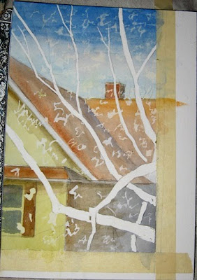
I decided to do this window scene after the 2 I did earlier in the series, when it was Winter.  I’ve often seen this sight full of gray sky and snow; a few days ago, with a beautiful spring day as inspiration, I saw the snow and gray replaced with bright blue, ‘snowing’ red buds.

I’m also calling it an exercise in masking-out.  I used liquid frisket for the tree and buds, masking tape for the window edges.


I'm considering the background done, for the most part.


Here it is, in color & Black and White,  with the frisket removed.  The next part of the painting will be to do the limbs and buds.  To be continued....


And here it is later, with some of the buds.

Monday, March 22, 2010

March 21- March 22, ‘10

Happy Spring!  Unbelievable.... yesterday was my first day of Painting Outside!  I didn’t see it coming.   I feel that I’ve been blessedly blindsided by the wonderful spring weather of the past few days.  I thought to gather up my things and go Somewhere but because I felt so grateful to feel secure in my Home, decided to stay home and celebrate the outside from the comfort of the porch.  Besides, B was coming to fix the bathroom ceiling and I wanted to talk to him and make sure to remember to tell him how grateful I am for his help in getting the people upstairs to lower their noise volume.

I worked out on the porch and talked to him on intervals when he wasn’t working on the ceiling.  I was happy to report to him that this week with the noise was the best in the 5 weeks since the people moved in, that they’d lowered the volume a great deal and I was again getting a good night’s sleep.

I’ve decided on this landscape scene from my porch; to do a painting of it while it’s still visible.  The trees in the foreground need to be there for the composition to make any sense to me.  I decided that I’d continue experimenting with the walnut drawing tool and frisket so drew in the background scene, then the trees, then covered the trees with frisket.  This part of the painting is very interesting & exciting for me in considering all the possibilities that arise from the act of separating the foreground from the background.  I also love making the meaningful strokes with the pen and frisket.  It’s a sense of something in me being momentarily freed. 


When the frisket was dry, I began to paint in the value pattern.  I decided on my favorite gray for tone, UB and BS.  I tried to keep everything soft for the initial development of the painting.  The actual sky was a light, somewhat grayed Blue, as if there was much haze in the atmosphere.  It seemed soft to me and so did the air.  It was warm, smelled sweet.  A fresh spring breeze has an undescribably sweet scent in it that defies words.


I worked on the painting for another hour or so last night and I worked on it for a few hours this morning.  The weather is still great today.  Not as warm as yesterday, but I’m not complaining.  I worked out on the porch this morning from 9 - 12:30.  I had my breakfast out there and quite a few phone chats as I worked.  I feel totally blessed to be here to so enjoy this beautiful spring day.


Here it is with the frisket removed.  The frisket turns a kind of greenish yellow on the paper.  The painting takes on a different light without the frisket.


March 22, 2010

I worked on this painting for awhile this morning, mostly on the trees.  I’m using a variety of gray made from UB and BS.  For more variety, I’m adding in red and yellow to the gray.  The darker gray for the unlit side of the trees and the yellow to lighten the gray for areas where there’s more light.  I also cooled the grays occasionally by adding in Pthalo Blue, which to me, is ice cold.

At one point I placed the painting on the floor and momentarily left the room.  When I came back, I viewed the painting from upside down.  The thought that came to me was “I like this....”  That’s when I decided to stop working on this painting.  


********

This morning I read an article on the Internet about the importance of Technology to the Artist.  My thoughts about how I use recent Technology in my painting have to do with the computer, digital camera and a computer program to use to enhance a photo that I’ve uploaded from my camera.

I use the viewfinder in the camera to compose my subject.  When looking through the view finder of the camera, I arrange my subject in the crosshairs of the view finder while mentally applying the Rule of Threes to my subject and how I’d like to arrange the drawing of the subject and all it’s supports on a piece of watercolor paper.  I take photos to remind me of what I may have been thinking/feeling when I took the photo.  When I’m painting I use the camera to record the various stages of the painting.  The viewfinder and then, the image reduced to a THUMBNAIL size gives me a new perspective on the painting and the progress.

Seeing the painting in a very small, thumbnail size gives me an idea of the balance and proportion of the composition.  I think that back in the times of the Renaissance, a series of lenses was used in a tool that was considered a technological advance called a Camera Obscura (?)  which in more modern times was refined into an item that was portable and used as a sketching aid for artists.  Seeing my image reproduced on the screen in a very small format allows me to critique my progress as to composition, value pattern, depth of tone or intensity of color, in a way that feels logical and understandable.

Another thing I like about the capacity of the photo enhancement program is that I can de-saturate a photo, which takes out all the color and leaves the image reproduced in a series of grays from dark to light.  To me, this is highly useful.

I like to imagine my paintings as an image that is carved into stone and then enhanced with color.  De-saturating a photo of a painting allows me to see whether or not I’m sticking with the value pattern I established after I’ve done the initial drawing.


Wednesday, March 10, 2010


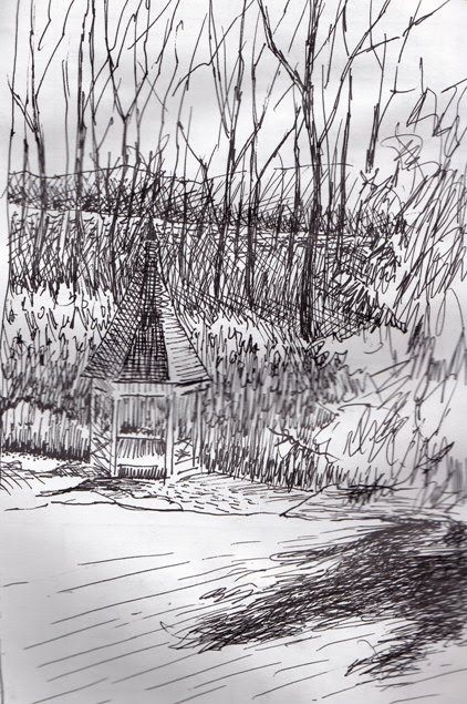
This is a sketch I did today at a place where I work.  I really enjoyed working on this drawing because today was sunny and warm.  I couldn't find one of my favorite BIC mechanical pencils in my bag or anywhere in my car so I used a ball point pen with black ink that I found in my purse with my checkbook. 

I've always loved Vincent van Gogh's drawings and used to study them often.  I read his letters many years ago and one of the things that impressed me was one where he's telling his brother how he'd  pick reeds from a swamp and then with a pocket knife, shape a reed into a writing instrument and use it to create a drawing.  He may have been trying to save money on art supplies, trying to impress his brother with his frugality.  I think that Vincent would have liked this ball point pen because I never had to pause to dip it in ink or fill it with watercolor.  I just drew, non-stop.  It had a nice liquid 'expressive' feel to it, although I don't consider the marks nearly as beautiful as those Vincent van Gogh made with a reed pen.

Monday, March 8, 2010

Peach and Playing Card II


I forgot to take a photo of this painting before I started adding in tone.    I made the decision to work on a toned ground, then made the decision that I’d use a mix of complementary colors to make the grays to build up the tone.  I don’t know why I decided to use Alizarin Crimson and Veridian other than it’s a pleasing mix, to me and I haven’t used it for a long time.  Before I started the drawing, I washed a thin and even coating of Alizarin Crimson over the entire sheet of paper.  When it was dry, I worked the drawing over it.  The thin coating of Water and AC was barely visible to the naked eye but was enough to show up & contrast the mix of neutral AC & V when I began setting up the tone on the painting.  

One of the ‘rules’ of watercolor painting that works for me; Start with a big brush, work from Light to Dark, Wet to Dry.  Using a large sable round and a thin mix of the tone,  I started at the top, worked from the dark area and into the light.  Every  element has been touched with paint, by now.  If not in the 2nd round, at least from the first.   The overall surface is exuding a rosy glow; the contrast between the red and the green.  The way I’m thinking of this surface right now is that there is plenty of room for pushing back, bringing forward as I continue the process of work on this painting.
What I intend doing next is an all-over erasing the graphite with a Pink Pearl eraser.  The two washes already applied have brought up a lot of graphite dust and I’m now finding the construction lines as unsightly, unnecessary, not smooth . ..
I’ve also washed in very thin layers of Light in the form of color.  There’s UB mixed with the tone mix, applied in a thin wash in the blue areas of the checked towel as well as the blue napkin behind the Peach.  Eventually, as I work farther, this pale wash will be seen only in the white check in the  towel pattern.  The next time I work in this area, I’ll be adding more color mixed with tone in a higher value (thicker, but still watery paint) and will go around the white check.
 I also used YO in the places on the ivory-colored cloth where there is the most Light.  I mixed it with tone to do the area behind the peach and the cards.  The lightest area is where I used pure Indian Yellow; enough to create a glow between the blue surrounding it.  The layers of color and tone were quite watery, but thicker than the 1st 2 layers of paint.

Today is the most spring-like day we’ve had in all of 2010.  What a blessing.  Sun, blue sky and a temperature forecast to be in the 50’s.


********
Here it is, an hour later.  


And here's an example of the Neutral mix made of Alizarin Crimson and Viridian;  I've tried to keep the mix more on the Viridian side than the Alizarin Crimson...


********

I worked on the painting for a few hours this morning, adding more tone, more depth, smoothing things out...  I'm pleased with this painting for now and will probably be done with it soon -- later, tomorrow....  Using the AC + V was ok but not my favorite tone.  I'm thinking about what it is I want to try next painting....


Wednesday, March 3, 2010


I started a new painting yesterday using Playing Cards in a still life set-up with a Peach instead of a Postal Card.  The Playing Cards are all found objects, things I’ve found, mostly out on the street,  throughout the past few years and being the pack-rat that I am, have saved.  (They might come in handy some day....)  


I used my favorite blue check dish towel and my favorite embroidered runner and an interesting dark blue tea napkin with an interesting border, the cards and a peach.  I’m using Winsor-Newton Aquarelle 140# watercolor paper.  I’ve been working for a few years on developing another series continuing a theme of Peaches and Postcards the theme of a series of paintings I 1st showed 5 years ago.  The blue check towel, embroidered runner, Peaches are familiar props; the Playing cards are a new addition.

I enjoyed doing the drawing.  Planning a painting as I’m working on a drawing is a pleasurable place for my mind to be.  I spent an hour or so arranging my setup and then working out my idea on the paper.  I enjoy being in a mind-space where possibilities are endless.  After I did the drawing, I wetted the paper thoroughly and added a bit of Raw Sienna to the bottom 2/3rds of the paper, a mix of GBB to the upper third.  As the surface dried, I used a variety of mixes to model the shapes, contours, shadows surface to the point where every object was separated, defined.  When the paper was completely dry, I outlined the flowers and the playing cards using a small chisel point nib on a calligraphy pen that I loaded with a thin mix of water and GBB.  When that bit of outlining was dry, I erased as much of the graphite from the drawing as I could.  I like this paper because it can take a lot of erasing without breaking down.  I made the decision to leave the pattern on the runner at the top of the painting until later.  I didn’t erase the graphite, nor did I outline the pattern with the pen.  


This morning, I reiterated.  I went over much of what I did yesterday, only moreso.   I said it again....  I’ve mostly intensified the blues and the shadows.  I’ve also cleaned up a lot of graphite and muddy bits with brush and water, especially on the cards.  To show the depth of the runner I started way in back with thin mix of Raw Sienna and GBB, worked forward, into the light.  In the light part of the runner, behind the cards, I glazed-in a thin wash of Raw Sienna and some of the mix from the higher & darker spot at top in the shadow behind the 3 of Spades as well as in the area behind the Nine of Hearts.  In the area of the cloth receiving the most light, I used a very thin wash of Indian Yellow.  The Peach, so far, is composed of grays using GBB and in the lighter parts, thin washes of CR and CY.  

I’m pleased with the progress, so far.  If I squint and view this painting with only my left eye, it’s easy to see the illusion of depth I’m creating on a flat surface with dabs of pigment.  


March 7, '10
 
Peach and Cards 1
I’ve been working on this painting this morning while watching Sunday Morning on TV.  When I began, this painting had been reiterated in quite a few ways over the course of the last few days, with many separate layers of paint, tone and/or color,  in the form of thin washes, color-glazes etc.    I’ve worked from Big Brush to Medium Brush to Small – the paint is built up to the point where it’s an attractive surface for work with a calligraphy pen, which is a  point where the all over paint surface is arranged in a pleasing to me manner.  I feel that there are 'ends' that need tidying up, little spaces to be filled in,  dark fine lines need to be made....

This morning I worked on this painting with a calligraphy pen filled with watercolor paint.  I really enjoy using the pen and creating an effect with it. I used it to create the illusion of stitches that edge the embroidered cloth, to create an illusion of stitches around the embroidered flowers on the cloth, in the stems, in the blue line on the card and to refine many of the shadows.      I am calling this painting Finis, for now, anyhow.  I reserve the right to do a little further tweaking at some point in the future....  But for now, this painting goes to the pile and I’ll soon start another.


Monday, March 1, 2010

Culvert St 030110


This is a photo of the drawing and the 1st wash.  It's difficult to tell that I used Raw Sienna for the sky and  a mix of RS and GGB for the houses.

It wasn't a great day to be working on a  painting as I was trying to get a lot of other things done.  I was interrupted by several phone calls and a knock on my door which turned out to be the FireWarden.  I thought he was here to make sure I had a working smoke detector -- which I do and he believed me but that wasn't why he'd stopped by.   He said he'd been in the basement and noticed that there was water that he believed may be sewerage backing up.  I told him I wasn't having any kind of problem, if I had, I'd have called the landlord.  He told me he'd call the landlord, which was fine with me because they can talk guy talk to each other.  The Fire Warden was very nice and we had a ten to fifteen minute chat.


The most fun part of this painting was the sky.  After the Raw Sienna was was dry,  I re-wet the sky area and started working in the blue.  As per usual, I can see after-the-fact that I could've used far more blue than I did.  At the time, however, sitting in my sunny window, the amount I used seemed to match my feelings about  how I felt about the blue sky today.  I also had a good time making dark or light, cool or warm grays with GGB mixing in a cool or warm color.  Some of the grays have more blue, some have red or Raw Sienna and in some of the warmer areas, I used a mix of warm or cool violet for the shadows.